
Proximal Value
Preamble
In the previous post on structural deepening, I repeatedly described the relative positions of components on the y-axis as illustrative.
This essay is part of the Wardley Mapping project, which brings together the maps, source and related writing used here.
That was convenient, but it left an important question unanswered. If we draw one component twice as far from another, should the extra distance mean anything?
We have said that the y-axis joins purposes to the principles, components and phenomena on which they depend. This gives us an ordering: a user need appears above the components that satisfy it, and those components appear above the sub-components that support their working.
But ordering alone does not tell us where, between the top and bottom of the map, to put anything. In this short post I want to look again at the y-axis and ask whether the distance between components can carry useful information too.
The y-axis revisited
Let us start with a simple chain of three components. A depends on B, and B depends on C. We can draw these components in the same order while changing the gaps between them, as illustrated in Figure 1.
If the y-axis records only dependency order, all three maps contain the same information. But the assemblies they represent need not behave in the same way. In one, every change to C may require B to be redesigned. In another, C may sit behind a stable interface and be replaced without B changing at all.
The dependency graph is the same. The propagation of change through it is not.
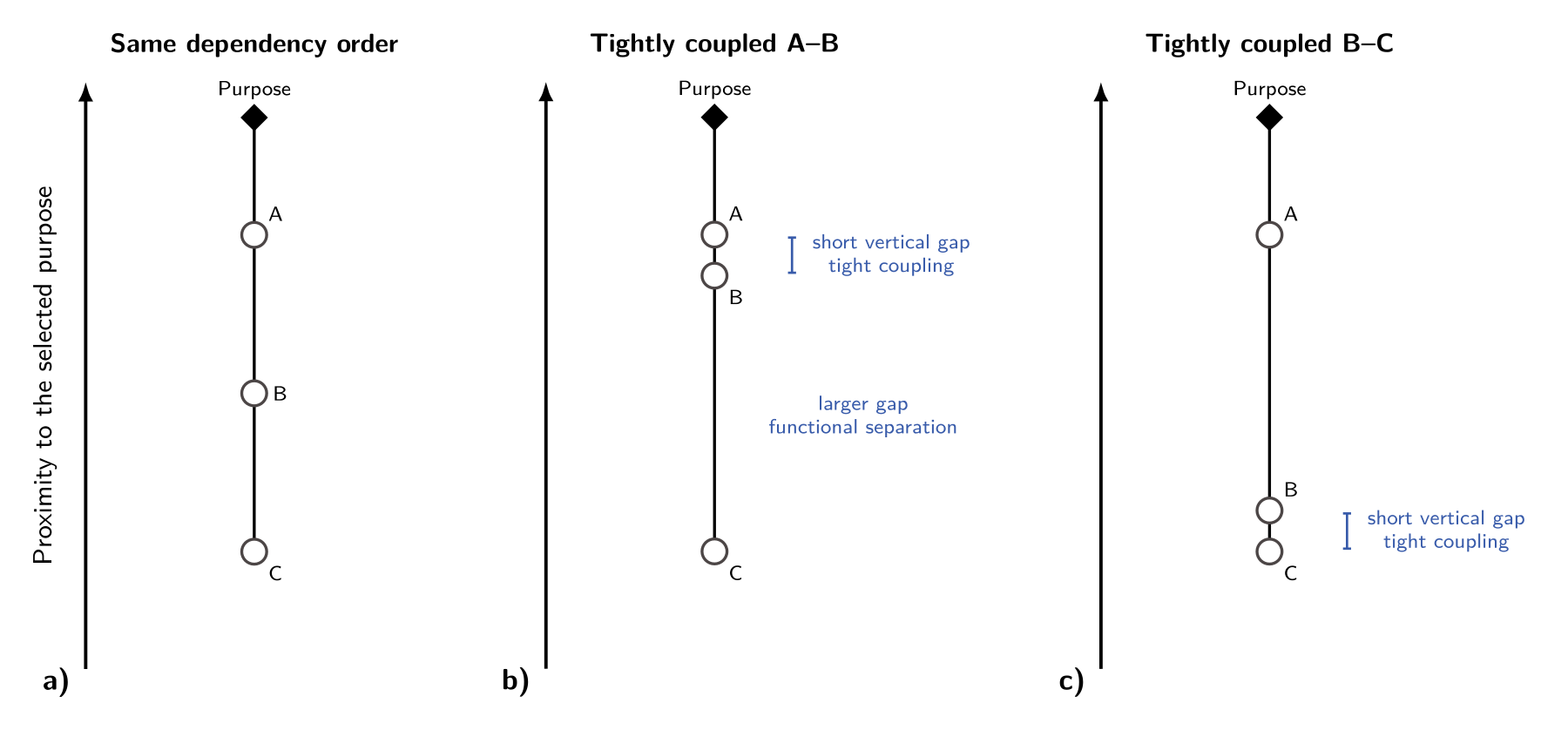 Figure 1. Dependency order does not determine vertical distance. In each panel A depends on B, and B depends on C. Short vertical gaps indicate components that must be changed or designed together; large vertical gaps indicate greater functional separation across a relatively stable interface. The purpose and dependency order remain fixed. The spacing is qualitative: equal-looking gaps should not be read as equal measured quantities.
Wardley describes the y-axis in terms of visibility: something close to the user is more visible than the components buried beneath it.1 This is a useful intuition. However, visibility can also make the distance sound like a property of what the user happens to notice. I think we can give it a more structural interpretation.
A map has a viewpoint
As with any map, a Wardley Map is made for a particular task. Its level of detail depends on what we are trying to understand. We therefore need to state the purpose or question that anchors the top of the map, the user or beneficiary whose purpose it is, and the assembly through which it is achieved.
For someone making a cup of tea, electricity sits below the kettle as a supporting component. For someone trying to balance an electricity grid, it is much closer to the purpose under consideration. Electricity has not changed. The question and the relevant assembly have.
The same component can therefore have different positions in different maps. Even within the same broad system, a change in use case may change which interfaces matter and how tightly the components must work together. A map is a view of a purposed system, not a context-free arrangement of technologies.
It is possible, in principle, to construct an aggregate view across several users or use cases. But the population and the relative weight given to each case must be stated. Such a map represents a portfolio of purposes; it is not a neutral or universal viewpoint.2
Dependency and distance
We can now give the vertical gap between two linked components a practical meaning. Ask what happens when the lower component is replaced or improved. If the change requires the component above it to be redesigned, recalibrated or developed at the same time, the two components are tightly coupled. We draw a short vertical gap between them.
If the lower component can change while the component above continues to work through a stable interface, they are more functionally separate. We draw a larger vertical gap between them.
Order tells us what depends on what. Vertical distance tells us how tightly those things are coupled.
Notice that the gap describes the relationship between two components, rather than an amount of value stored in either one. A short vertical distance means strong coupling; a large vertical distance means greater separability. A component’s overall proximity to the chosen purpose follows from the interfaces through which its contribution passes.
For our purposes, I will call this idea proximal value. The word value refers to the selected purpose at the top of the map. Proximal reminds us that a component’s position is relational: it describes how directly its contribution is connected to that purpose through this particular assembly.
This does not yet turn the y-axis into a precise ruler.3 It gives the spacing an interpretation and, therefore, something against which a map can be challenged. If two linked components have a short vertical gap, we should be able to explain what makes them difficult to change independently.
Moving on the map
The x-axis and y-axis now describe different aspects of a component. The x-axis describes its maturity in a relevant market or field of use. The y-axis describes its relationship to a purpose through a particular assembly.
It is tempting to assume that a component moves down as it moves right. But maturity does not directly determine vertical position. If the assembly and its interfaces stay the same, a component can mature without moving vertically at all.
Maturation may, however, enable an architectural change. A standard interface can insulate one component from changes in another, increasing the distance between them. An abstraction layer can hide a mature component beneath a new one. Conversely, components that were previously separate may be integrated into a new assembly and require close co-development. In that case the distance can narrow.
The component moves vertically because its relationship to the assembly has changed, not simply because time has passed or the technology has matured. Figure 2 first shows four configurations separately, then superimposes them so that we can see the path of A without detaching it from its relationship to the Offer above it.
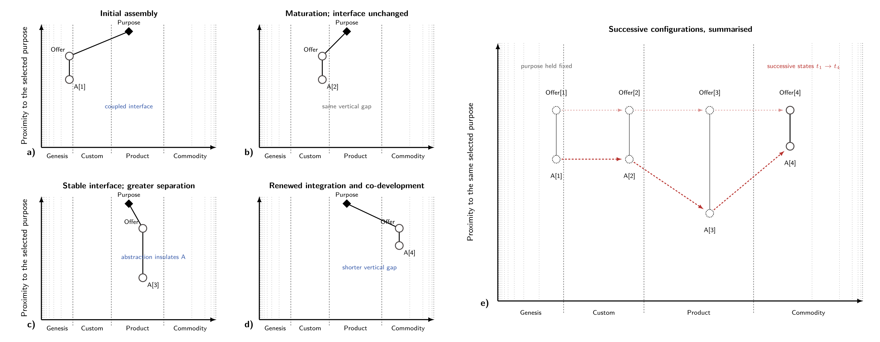 Figure 2. Panels (a)–(d) show four possible successive configurations under a fixed purpose. Panel (e) superimposes the same time slices. Grey and black vertical rungs show the Offer–A dependency in each configuration; red dotted arrows connect successive positions through time. A[1] to A[2] matures without changing the gap, abstraction increases the separation at A[3], and renewed integration reduces it at A[4]. The path and distances are schematic, not a general life-cycle law or calibrated measure.
Reading the axes together
The horizontal and vertical axes answer different questions and use different scales. The length of a diagonal line between two components therefore has no defined meaning.
Our eyes do not find this entirely natural. A link that crosses most of the x-axis while moving only a short way down the y-axis looks long, even though the short vertical gap is meant to tell us that the components are tightly coupled. I have seen this configuration frequently in practice on people’s maps.
Such a link is not necessarily wrong, but it makes a strong claim. It says that components at very different stages of maturity cannot readily be changed independently. A novel component may be coupled directly to a mature utility even though the two are developed at different rates and by very different methods.
Before interpreting the shape, we should check that the components have been positioned using the same market or field of use, and described at a similar level of granularity. Otherwise the apparent difference in maturity may be an artefact of the way the components have been classified.
Once this has been checked, the pattern has three useful readings. First, the map may have omitted something. A novel application might appear to depend directly on a commodity database, when in practice it depends on custom integration code, configuration, a particular schema or an operating process. Making that component visible often reveals where the tight coupling actually lies, and where a more stable interface creates separation.
Second, the mature component may have been defined too broadly. A database product may be mature while its assembly-specific deployment and configuration remain custom built. These are different components for the purpose of the map.
Finally, the mismatch may be real. The novel component may genuinely depend on the internal details or peculiarities of the mature one. In this case the long horizontal link reveals architectural strain or lock-in rather than a drawing error. It identifies an interface that deserves attention.
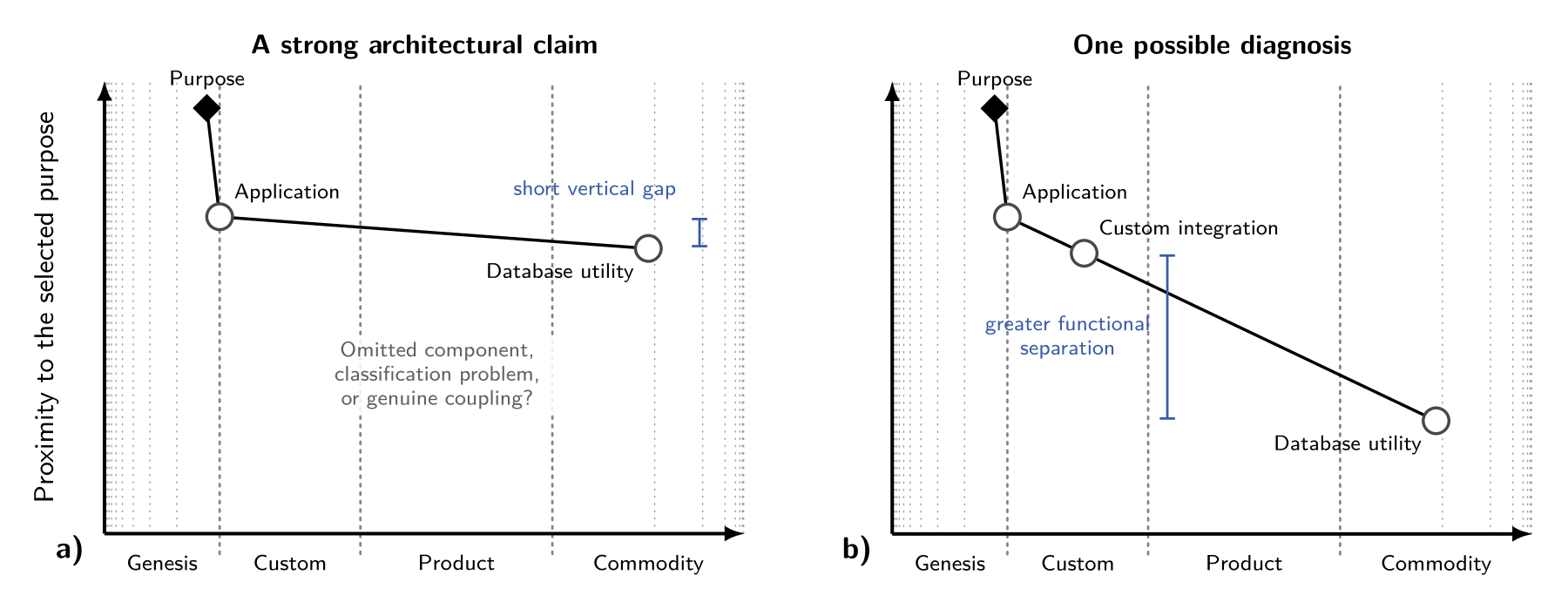 Figure 3. An illustrative diagnosis. A large maturity difference combined with a short vertical gap should be examined closely. The direct dependency may conceal a custom integration or configuration component, as one possible redrawing shows here, or it may identify genuine tight coupling between components that require different methods and rates of development.
Systems within systems
In the previous post we saw that technologies are recursive. Components are made from sub-components, which are themselves technologies. Coupling gives us a practical way to decide when to show that internal structure and when to hide it.
Consider the jet engine again. A change to the compressor may alter the airflow, pressure and shaft conditions for the turbine and its control systems. At the level of engine design these components need to be shown, because changes propagate between them. At the level of a map concerned with an airline service, much of this detail may be collapsed into a single engine component.
A group of components that is tightly coupled internally, but connected to the rest of the system through a more stable interface, forms a natural aggregate. We can draw a boundary around it and treat it as one component at a higher level of abstraction. When the internal design problems matter, we can expand it again.
This does not give every assembly one correct boundary. The useful boundary depends on the question being asked. Nor is the maturity of an aggregate simply the average maturity of its parts. Once treated as a component, the aggregate has its own purpose, interface and path of evolution.
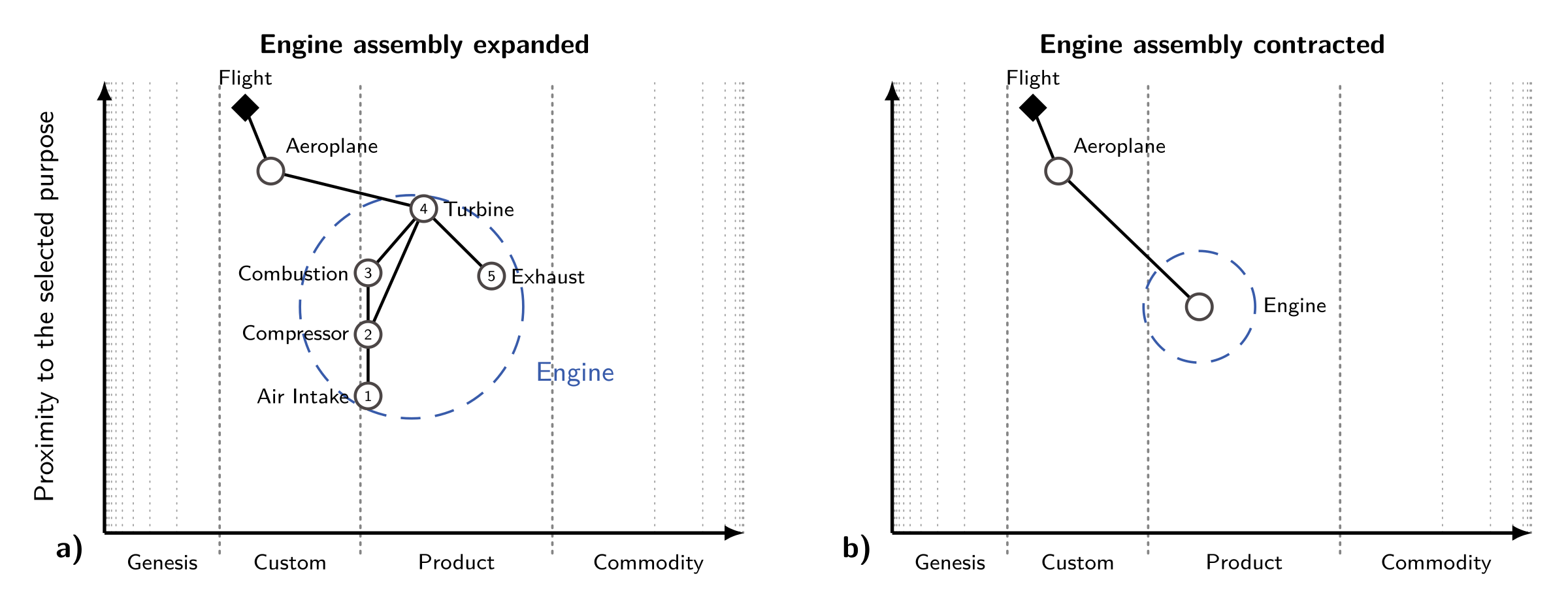 Figure 4. Tightly coupled components can be treated as an aggregate component at a higher level of abstraction. Expanding the aggregate reveals the components that must be designed or changed together; contracting it preserves the more separable external interface. The aggregate retains its own map position; its maturity is assessed at the assembly or interface level, not averaged from the maturity of its parts. The spacing shown here is schematic.
Proximity is not importance
The term proximal value could easily be misunderstood. A component drawn lower on the map is not necessarily less important, less valuable in economic terms, or less damaging when it fails. Electricity may be remote from the purpose of making tea while remaining indispensable to it.
Nor does vertical position tell us where the next useful improvement will occur. A deeply buried component can become the constraint on the performance of the complete assembly. That may make it strategically important without changing its dependency distance.
The y-axis described here is about the architecture of contribution: the route through which a set of coupled components fulfils a selected purpose. Other properties such as criticality, cost, performance or value captured may be shown separately, but they should not be smuggled into the same coordinate.
Summary
- A map is anchored by a selected purpose, user or use case.
- Dependency determines the vertical order of components.
- The vertical gap between linked components can represent functional separation: tight coupling produces a short vertical gap and greater separability produces a larger one.
- Tightly coupled clusters can be expanded as assemblies or contracted into aggregate components.
- Maturity does not directly determine vertical position, although maturation may change the architecture and interfaces from which coupling arises.
- A large maturity difference combined with a short vertical gap is a strong architectural claim: it may reveal an omitted component, an over-broad definition or genuine coupling across different stages of evolution.
- Proximity to purpose is not the same as importance, economic value, criticality or the value of the next improvement.
Where next?
We are now in a position to return to the distinction promised at the end of the previous post. A focal technology can improve as an object of development, while the performance achieved in use still depends on the other components and complements with which it must work.
In the next post we will distinguish the as-developed performance of a focal technology from the as-used performance of the main assembly. We will use photolithography to see why an apparently superior technology may still take years to displace its predecessor.4
Once distance carries information, the question is no longer simply how quickly the focal technology moves to the right. We must also ask whether the rest of the assembly can move with it.
Downloads
Download this article as a PDF.
Download Figures 1–4 as a four-page all-vector PDF, or download the editable Wardley-TikZ source.
References
-
Wardley, S., comment on visibility and distance in the value chain, 2020; and Wardley, S., Topographical intelligence in business, 2016. ↩
-
An aggregate view should be constructed from comparable descriptions of the underlying purposes and explicit weights. Averaging the distance between nodes on maps drawn to different scales would not, by itself, produce a meaningful measure. ↩
-
A Wardley Map is a projection of a more complicated dependency graph. In a branched graph, one vertical coordinate may not preserve every relationship exactly; in a graph with cycles it cannot provide a strict ordering at all. For now, the safest interpretation is comparative and local: explain the spacing between components that are directly linked, and collapse mutually dependent elements into an assembly where that is useful. ↩
-
Adner, R. and Kapoor, R., “Innovation ecosystems and the pace of substitution: Re-examining technology S-curves”, Strategic Management Journal, 37: 625–648, 2016. ↩